
Decomposition of Time-Series
We use decomposition to examine time series as a combination of seasonality, noise, and trend components. It can be used instead of Holt’s and Winter’s Method as it can analyze seasonal variation like H-W.
In this analysis, I used the data of Best Buy’s retail sales of electronics and appliance stores (RSEAS) and it has been given in millions of dollars. The frequency of the data is monthly, and it is not seasonally adjusted.
As a first step, I started with creating the decomposition plots below, as additive and multiplicative model. Plots display actual data, the trend line, the fits -that are calculated from the trend and seasonal components- and accuracy measures.

Figure 1:

Figure 2:
After making two separate decomposition plots as additive and multiplicative, I detected only minor visual differences between the models which did not help me to make a decision between them.
According to their accuracy measures, MAPE is the same, 11, which tells us in both of the models, our forecasts have a chance to be 11% off. MAD is 742 in the Additive and 738 in the Multiplicative model. Since MAD represents the error between fits and actual data, smaller values indicate a better model. Lastly, MSD represents the accuracy of the fitted values with standard deviation, smaller values again indicate a better model therefore according to MSD additive model is a better fit.
Considering outliers have a greater effect on MSD than on MAD and the data has quite outliers, I decided to use the Multiplicative model in the rest of the report since the MAD was lower.
Component Analysis

After subtracting the trend component from the original data, we find the detrended data. We can see that all data points have been brought around 1, besides there aren't many visible differences between original and detrended data.
After removing the seasonality, I found the seasonally adjusted data. Of course in this, we can detect the differences openly. Firstly, the increased sales every November-December nearly disappeared. This is a great indication that the model is effectively working. Only after 2017 data shows some seasonal effects.
Lastly in the seasonally adjusted and detrended data, we can see the noise and irregulates. Between 2002 and 2008, data still shows seasonal effects. After 2012, I do not think the graph works properly because we can still see the seasonal effect and abnormalities. Probably, outliers poorly affected the calculations of the graph.
Seasonal Analysis for RSEASN

Firstly, when we look at the seasonal indices, in the first 10 months results are below 1, therefore we can say that in the first 10 months Best Buy's sales are below average. In April, the company had the lowest expected sales in accord with average sales. Its value is 0.85 therefore in April, sales will be observed as 15% less than the average expected sales.
In the 11th and 12th months, results are above 1 therefore expected sales are higher than the yearly average in those months. So in December, we are expecting around 1.6 times higher sales.

When we came to detrended data, the first thing I noticed is, in the first 10 months except August, results vary below 1.0. Only in August, the median is 1.05 and the range includes above and below 1.
In November the median is 1.16 and this means we are expecting sales 16% above the average. On December 1.6, we are expecting sales 60% above the average in that month. Moreover, many outliers are below 0.7 and no outliers above 1, which tells us we could see, not expected lower sales.
Percent Variation Graph
In the first 9 months, sales variations expected between 6.5% and 8.7%, and in the 10th month, we are expecting variations around 6%. In the last two months, data had higher variation percentages. In November it is 9% and in December it is 14.5%. This means in the last two months sales can vary more than the other months.

Finally, in the Residuals, we can see whether the model underestimates or overestimates. Besides the 11th month, all results’ median seems around 0 which tells us the model is working adequately. Only in November, the model is overestimated by 346. In December sales have higher chance to vary more.

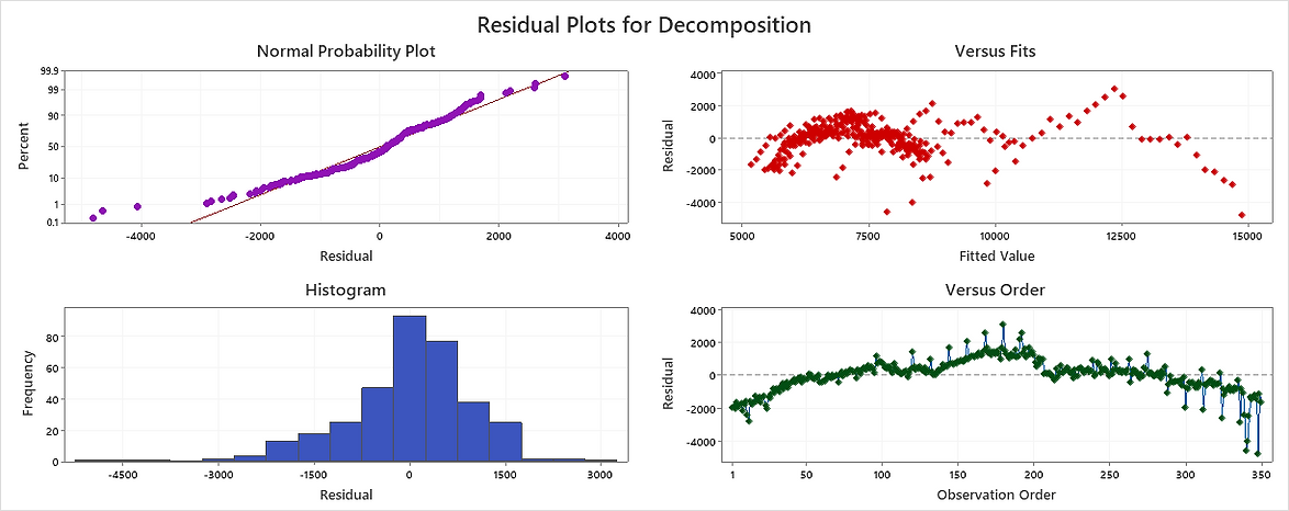
-
In the Normal Probability Plot, we expect data to follow a straight line and in our results, it nearly is which tells us the residuals are normally distributed.
-
In the Versus Fits, data should be around 0. It is a little mixed in this data results which indicates the residuals may be biased and have a nonconstant variance.
-
When we look at the versus order, we should not see any pattern, and the residuals should fall randomly around the center line but, in this case, I can see some patterns. In the first 200 observations, there is a long-term trend that indicates the model does not fit the data but after that, it seems like a perfect fit.
-
Finally, Histogram is great, it has a recognizable Bell Shape structure around 0 and again we can see the effects of the outliers, especially in the negative side.
Real-Life Comments
Since the data is electronic goods sales data, it is not very difficult to predict the explosion time of sales. Predictably, the biggest seasonal spikes were because of Christmas and Black Friday, which boosted November and December sales. The general tendency of people is to buy electronic items that they postpone or want to buy for a long time before the year changes. This may be for material or moral reasons. The best time to do this shopping is at the end of the year because of the possibility of the prices going up next year. The end of the year is also the best time to shop for electronic goods for families who want to reward themselves by evaluating the remainder of their annual budget.
Data values are increasing in the positive direction. But this happens over a very long time and very slowly. Although there is a lot of noise between the start and the end, they are not too far apart (1992-Jan 3657 and 2021-Feb 6737). The lowest point in the data was the period when COVID-19 spread around the world and home quarantines began in April 2020. This is how I interpret the reason for the low sales.
Resources
This analysis is edited version of my previous term project for the 'Business Forecasting' lecture at Dokuz Eylul University. All the content displayed here has been created by me.
U.S. Census Bureau, Advance Retail Sales: Electronics and Appliance Stores [RSEASN], retrieved from FRED, Federal Reserve Bank of St. Louis; https://fred.stlouisfed.org/series/RSEASN, April 13, 2021.