
Time-Series Analysis of Retail Sales
The data units of Best Buy’s retail sales of electronics and appliance stores (RSEAS) have been given in millions of dollars. The frequency of the data is monthly, and it is not seasonally adjusted.
First, without creating any graphs or tables, I examined the retail sales numbers in excel and the first thing that draws my attention is that throughout the months sales are similar except in November and December. In these months retail sales are relatively higher than the other months but to say anything about seasonality, first, I need to examine time series plots, autocorrelation, and other preliminary data analysis.
1. Descriptive Statistics
Descriptive statistics are useful for describing the basic features of data.
There are total 350 numbers of data in the data set. There are no missing values. Observations started in January 1992 and continued until February 2021. The median and the mean both measure central tendency. The mean of the data is 7633 and the median is 7626. They are close to each other which is good but when data has outliers, it's better to use the median as the central point because unusual values affect the median less than the mean. As a result of the similarity between the mean and median, we can say that the data is symmetric. The minimum value in the data set is 3228, the maximum value is 15458, and the difference between them or the range is 12230. We can say that it has a relatively high amount of dispersion.

When I examine the histogram, it seems like values are fairly distributed and have a kind of right-skewed pattern. Q3 is close to the median and really far away from the maximum value which also indicates a right-skewed pattern, and finally, we can see it also in the blue box of the boxplot. That is probably because of the seasonal increase in sales in November and December which creates higher outliers. Again, when we check the boxplot in the figure, we can clearly see the outliers which are represented by “ * ”.
2. Time Series Plots

Figure 1:
Figure 1 shows us the retail sales of Best Buy between January 1992 and December 2020. Just by looking at this plot I can say that there is a slightly increasing linear trend between the beginning of 1992 to the middle of 2008. After the middle of 2008, the pattern seems to be more horizontal.

Figure 2:
In terms of the seasonality component, when I look at Figure 1, we can easily detect the seasonality pattern of RSEASN. Firstly, in the 11th month of every year, we see an increase in the retail sales, but especially on the 12th of each year, we observe a significant increase in the sales. This indicates that the data has a significant seasonal pattern. To see the pattern more clearly, I added Figure 2, which is a time series plot of the last 5 years, therefore I can spot the change in the sales in months more easily. In terms of the cyclical component, I can not say it has cyclical behavior right now.
Finally, in terms of irregular components, I couldn’t detect any residual fluctuations, but we saw episodic fluctuation in the year 2020. When we look closely, everything is normal until the 3rd month of 2020 but in the 4th month, there is a significant decrease in the sales and this irregular decrease continues for months. It was most probably because of the global pandemic Covid-19. The pandemic was unpredictable but recognizable, therefore these fluctuations are episodic. Again, in Figure 2 I can easily see the irregularity in the 2nd quarter of 2020.
3. Trend Analyses
Trend values are also called fits. The trend values are point estimates of the variable at a time (t).

Figure 3:
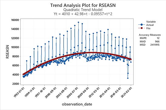
Figure 4:
In Figure 3, the linear trend analysis plot is displayed. The plot includes the fits that are calculated from the fitted trend equation and the accuracy measures. We can easily see that model does not fit our data.
Then I tried the quadratic trend model, as you can see in Figure 4, . At the first glance, it was the best fit for the data. When we compare the accuracy measures of the following two plots, we can see that all the numbers are lower. This also indicated that quadratic trend model is a better fit to the dataset.
3.1. Residual Plots of Trend Analyses
When we look at the residual plots and compare, Quadratic Trend model again seems like a better fit. In the histogram of the residuals, all residuals should be around 0 and randomly distributed. Both of them seem okay, in addition I can say, there is higher range of outliers in the first histogram.

Figure 5:
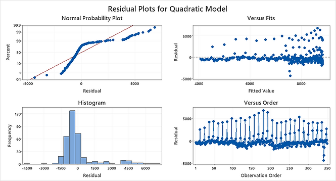
Figure 6:
The normal probability plot of the residuals should approximately follow a straight line if the residuals are normally distributed. They both seem like an S-curve which implies a distribution with a long tail. Besides the accuracy measures and trend analysis plot, linear trend model seems like a better fit in terms of the normal probability plot.
In the residuals versus fits graphs, we determine whether the residuals are unbiased and have a constant variance. Ideally, the points should fall randomly on both sides of 0, with no recognizable patterns in the points. In the quadratic trend, fitted values seem to have a more constant pattern. But in both models, I can detect outliers and some recognizable patterns, probably because of the seasonal characteristics of our data.
Finally, when we look at the residuals versus order graphs, we can determine how accurate the fits are compared to the observed values during the observation period. Ideally, the residuals on the plot should fall randomly around the center line as in versus fits. Again, quadratic trend analysis seems better than the linear one but is still not a good fit. It cannot catch the seasonal patterns.
4. Autocorrelation Function
Autocorrelation is a mathematical representation of the degree of similarity between a given time series and a lagged version of itself over successive time intervals. Time units are represented by k, and it can be as high as N-1, which is 349 in this case, but it seemed unnecessarily long therefore I did it with 63 lags. In the following table, I only added the first 25 observations.

When I examine the results, the first thing that took my attention is, that the data is positively related to time patterns. If a series has a seasonal pattern, a significant autocorrelation
coefficient will occur at the seasonal time lag or multiples of the seasonal lag. This data is monthly therefore for understanding seasonality we should check for lag 12, lag 24…
At the 0.05 significance level, lag 12 is 0.89, and lag 24 is 0.80 which is not close to 0 and above the significance level, this means there is seasonality in our data. This significant outcome continues in lag 36, lag 42, and lag 54. This indicates data has really strong seasonal characteristics.

Figure 7:
If a series has a trend, successive observations are highly correlated, and the autocorrelation coefficients typically are significantly different from zero for the first several time lags and then gradually drop toward zero as the number of lags increases.
The autocorrelation plot starts with a high autocorrelation at lag 1 that slowly declines. Until lag 14, outcomes are above the significance level and slowly decreasing (without considering seasonal effects). This shows us that our data has a trend pattern too.
Finally, to decide randomness, we should look at the lags and decide how close they are to zero. After lag 13, outcomes are below the significance level (without considering seasonal effects), and around lag 22 data becomes random, unpredictable.
Resources
This analysis is edited version of my previous term project for the 'Business Forecasting' lecture at Dokuz Eylul University. All the content displayed here has been created by me.
U.S. Census Bureau, Advance Retail Sales: Electronics and Appliance Stores [RSEASN], retrieved from FRED, Federal Reserve Bank of St. Louis; https://fred.stlouisfed.org/series/RSEASN, April 13, 2021.